CherryPicks
The place to find out what women are thinking about movies.
The current version of TheCherryPicks.com was originally designed and developed by D/T/E Studio, and I was brought on to iterate on the existing design, fixing bugs and implementing new features.
Film Page
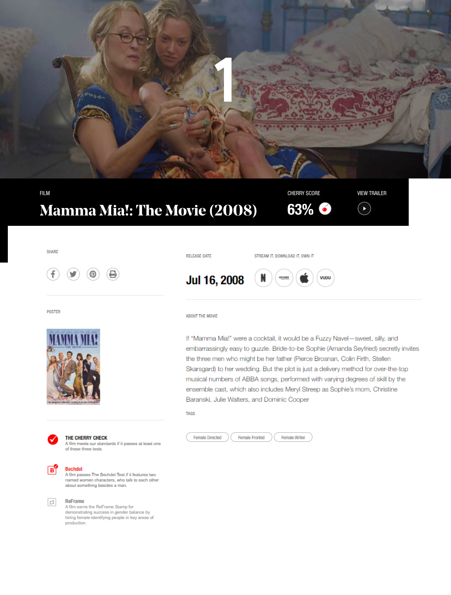
Original Design (Developed by D/T/E Studio )
Film Page 2020
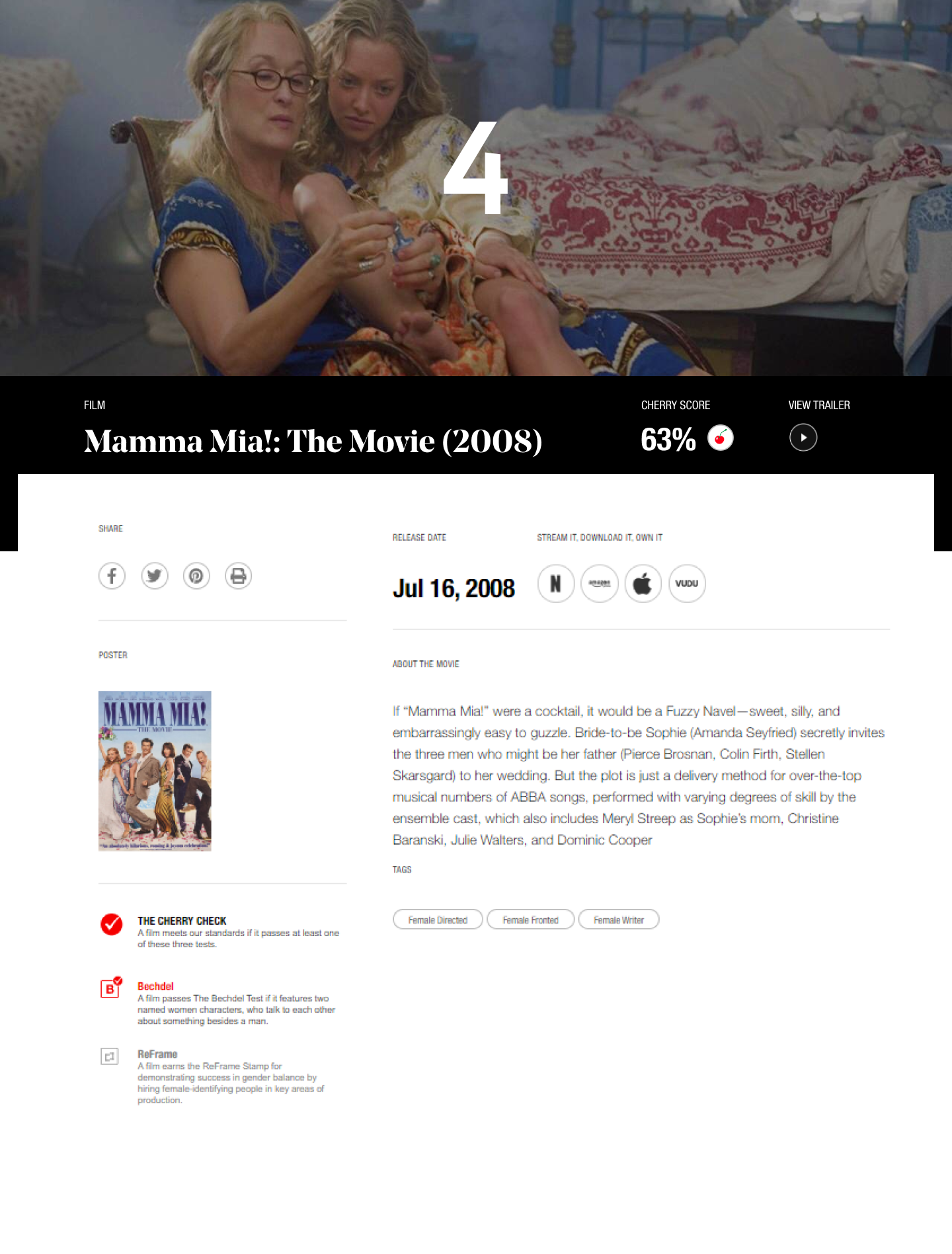
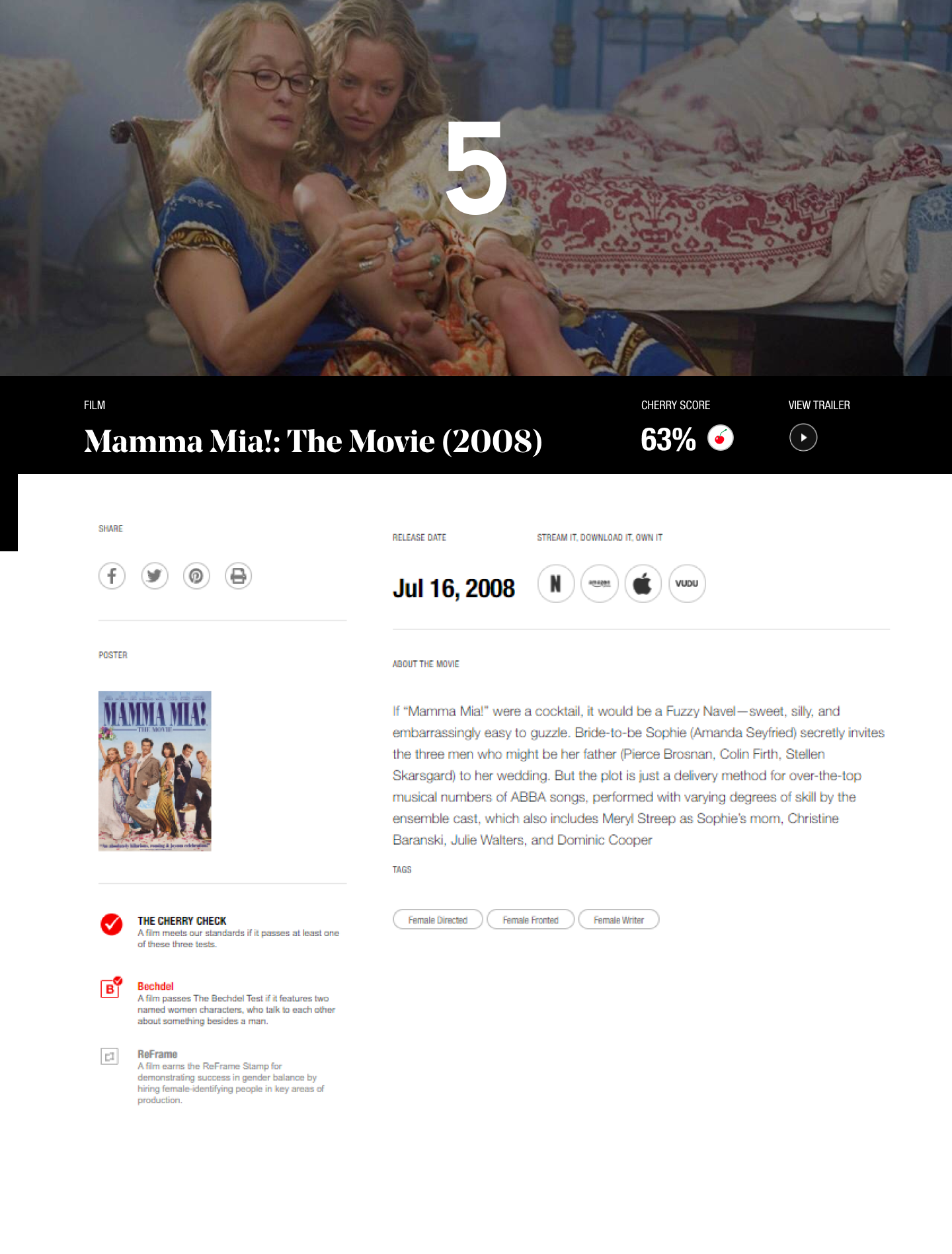
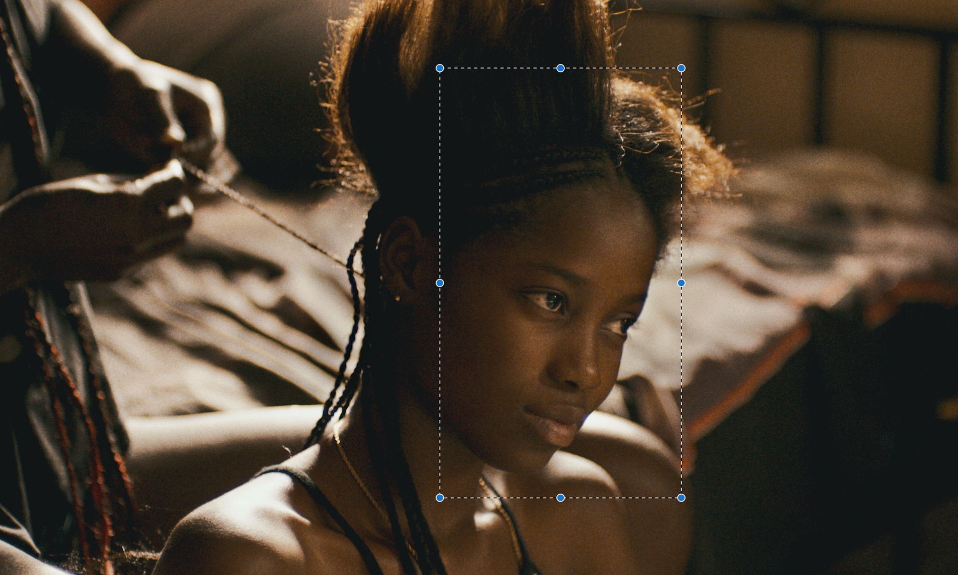
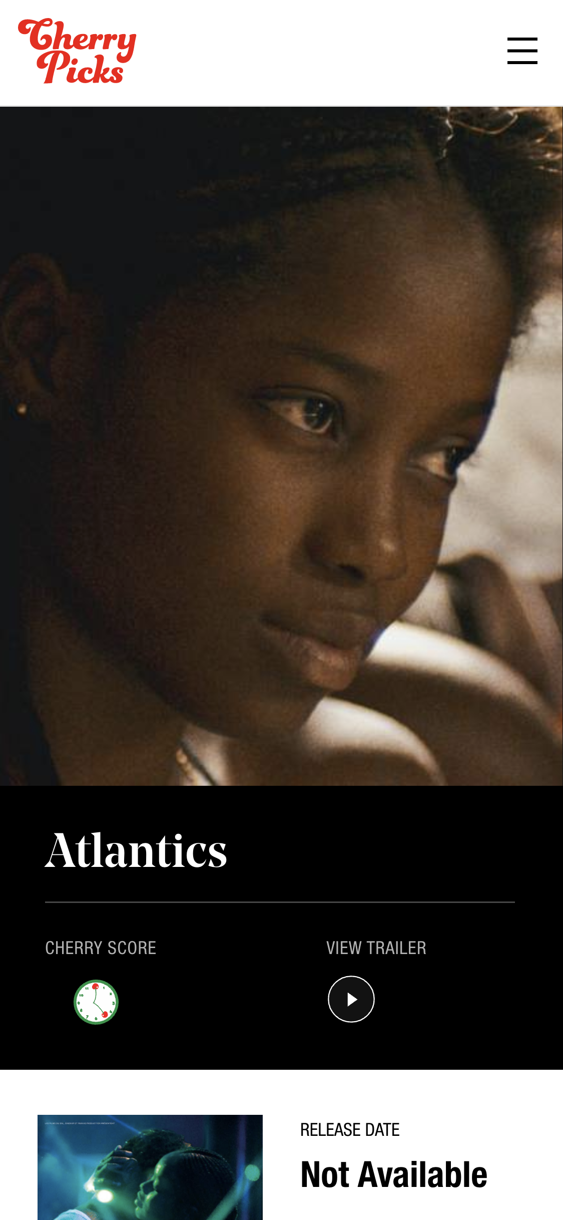
The Film page cover image (or hero image as it's referred to by the CherryPicks team) was a major pain point for the web editors and review aggregators. It was difficult for the team to input images that would look good on both desktop and mobile, and too much of their time was spent editing and reuploading images. There were two problems: (1) The title banner would sometimes cover key image details and (2) On mobile, the hero image was resized from the center often cropping the image in awkward places.
Unfortunately, film stills aren't uniform. Key parts of the image are not always centered in the middle of the frame. An improper crop can change the meaning of the image. Sometimes the important thing is the people and sometimes it's the blank space. It depends on the story the filmmaker is trying to tell.
Example stills from 37 Seconds, Booksmart, and Bull.
Solution 1: Resize and shift the film banner
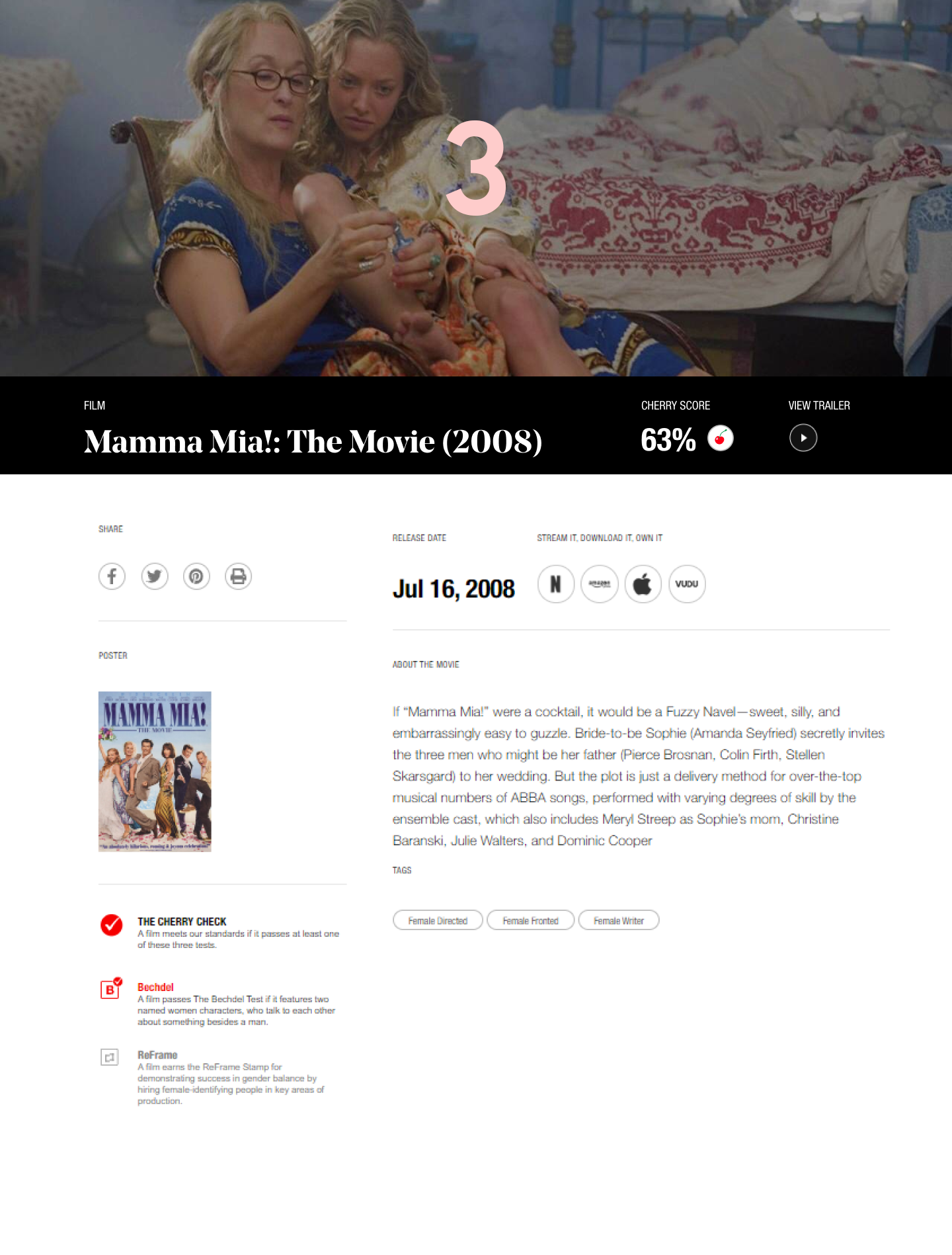
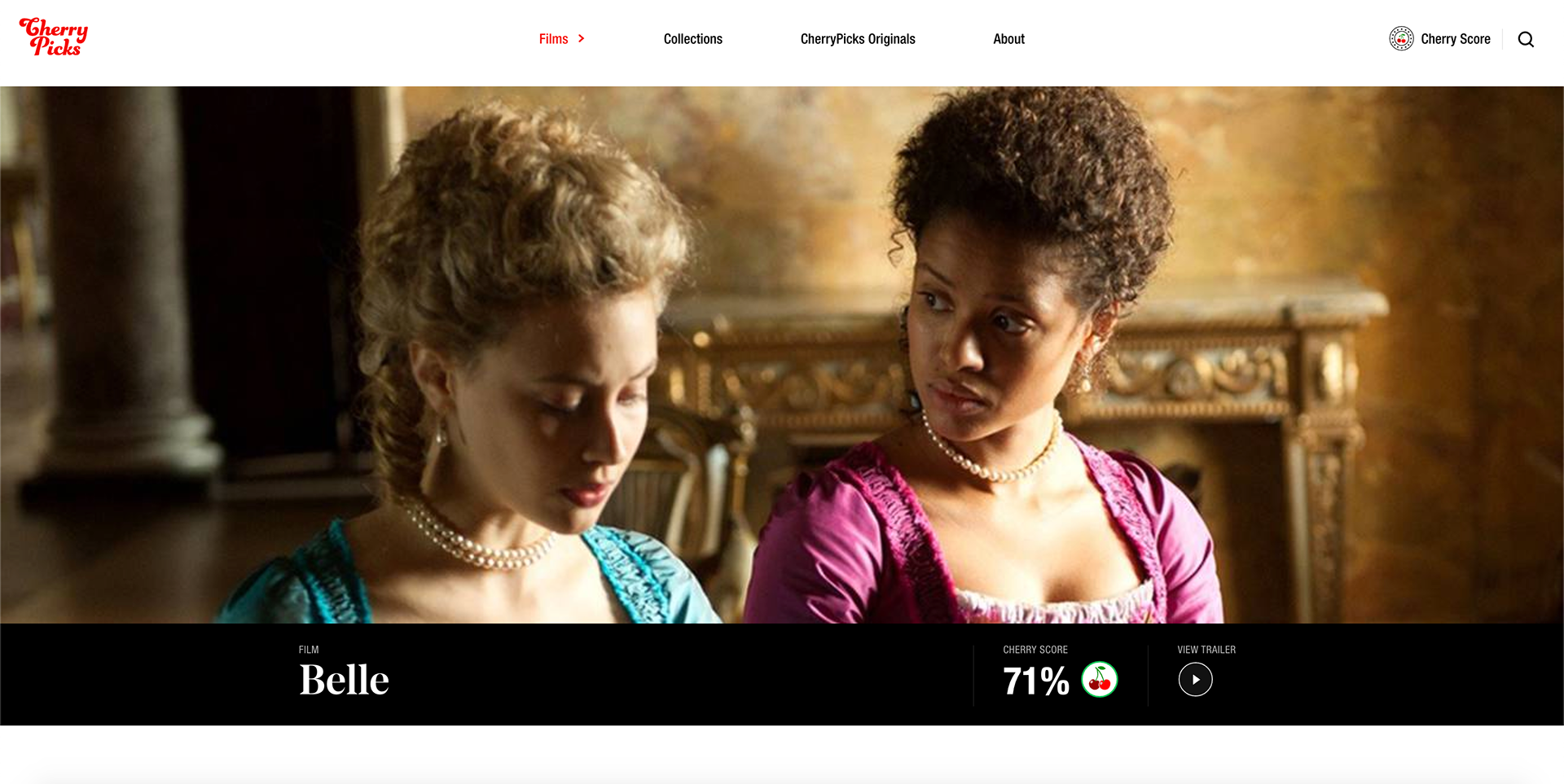
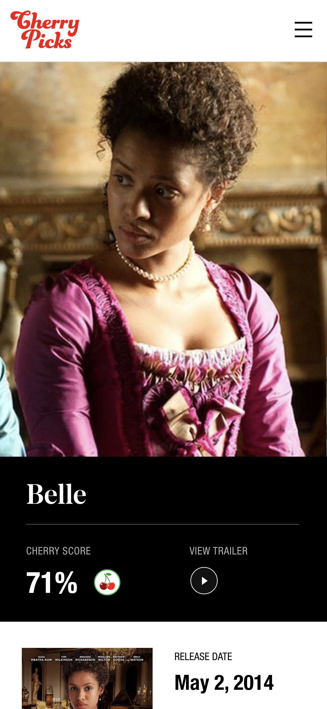
The first thing I did was decrease the size of the film title banner and separate it and hero image. This required a slight redesign because the previous style of the banner looked awkward without the overlap. Now, the full hero could be displayed on desktop, but mobile heroes still had the cropping issue.
Option 3 was selected.

Solution 2: Enable Wagtail Focal Point
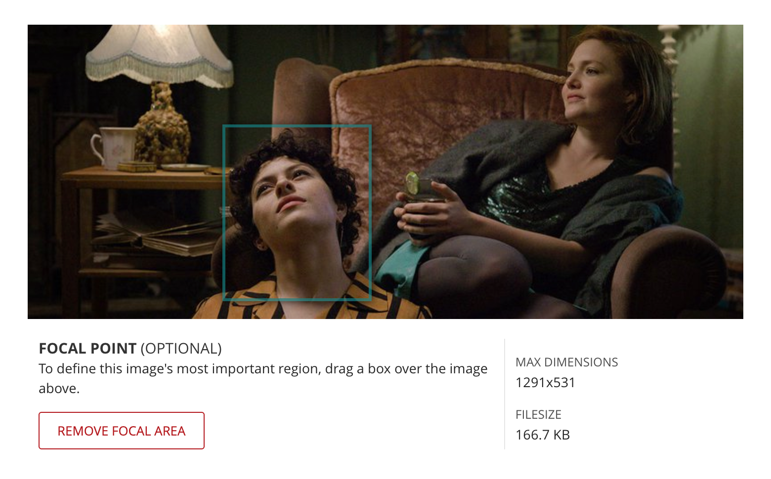
Next, our backend developer enabled the wagtail focal point feature which allows a user to select a focal point to be used when the image is resized. A 450 x 800 px mobile image containing the focal point is shipped to the front end.
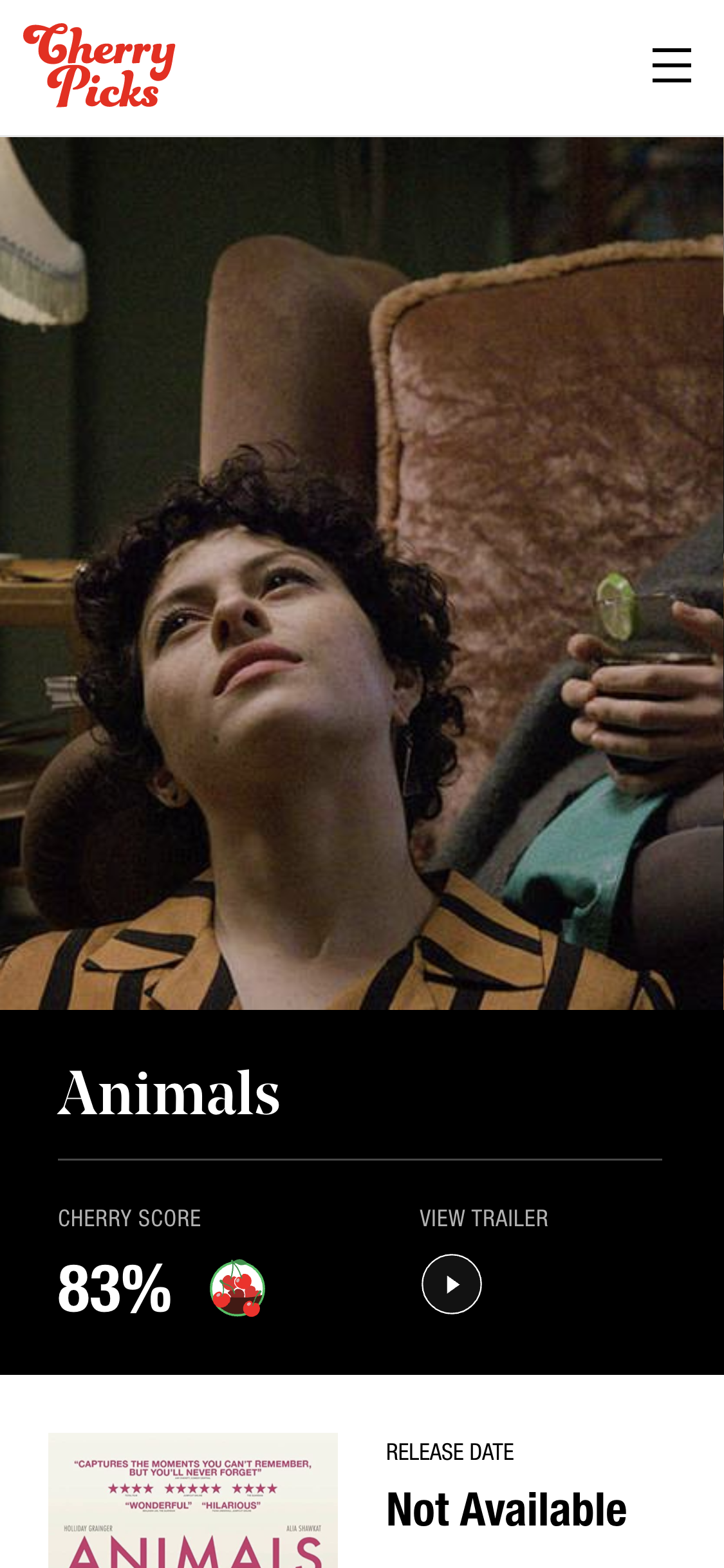
Mobile hero resizing was better, but not perfect. It’s hard to have an image that works wide as a hero and also vertically for the mobile layout. Some hero images still lost their meaning when resized on mobile.
Solution 3: Manual Mobile Image Override
Our backend developer added a new field to the film page editor for the mobile heroes. So now, if the auto resize fails to produce a suitable mobile hero, the editor can upload an image specifically designed for mobile. If such an image is provided, the front end will use that image on mobile devices.
Ad Space on CherryPicks Originals
Most of CherryPicks' revenue is generated from native advertising and sponsored content such as sponsored film collections. Enabling ads on their article pages (CherryPicks Originals) was the natural evolution.
The Ask
Custom ads on sponsored Originals.
Mockups
Desktop Option 1 and Mobile Option 2 were selected.
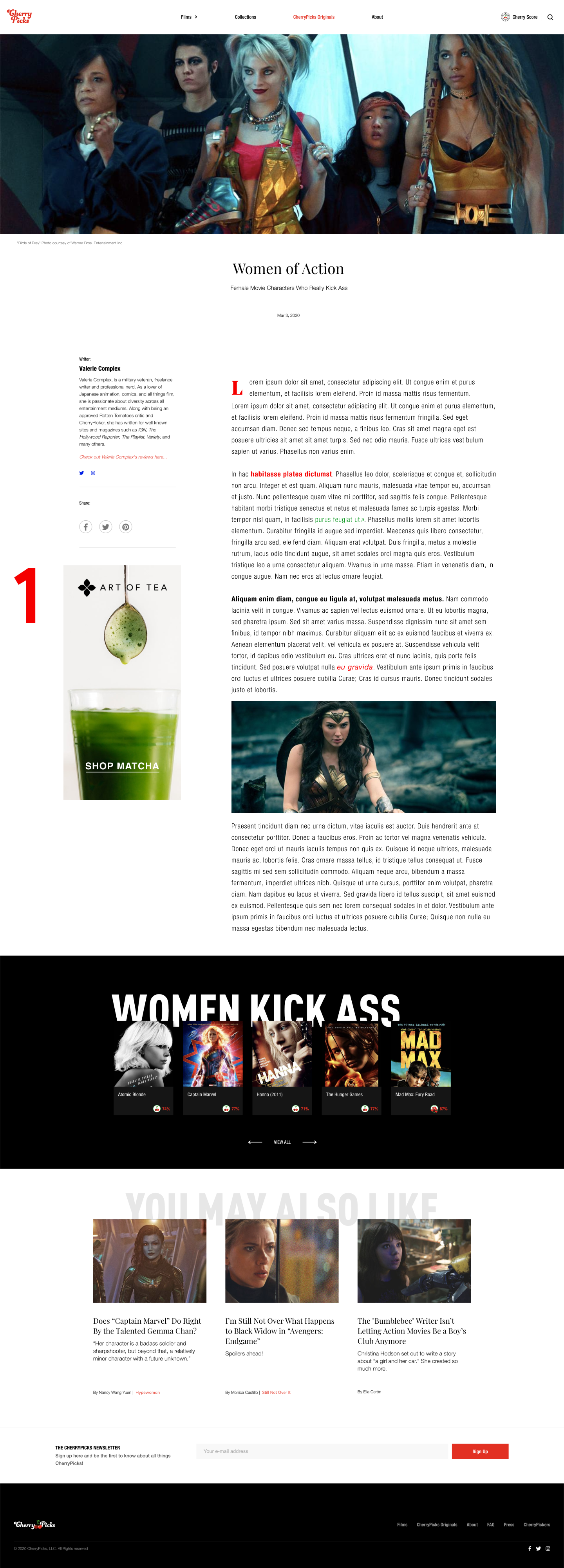
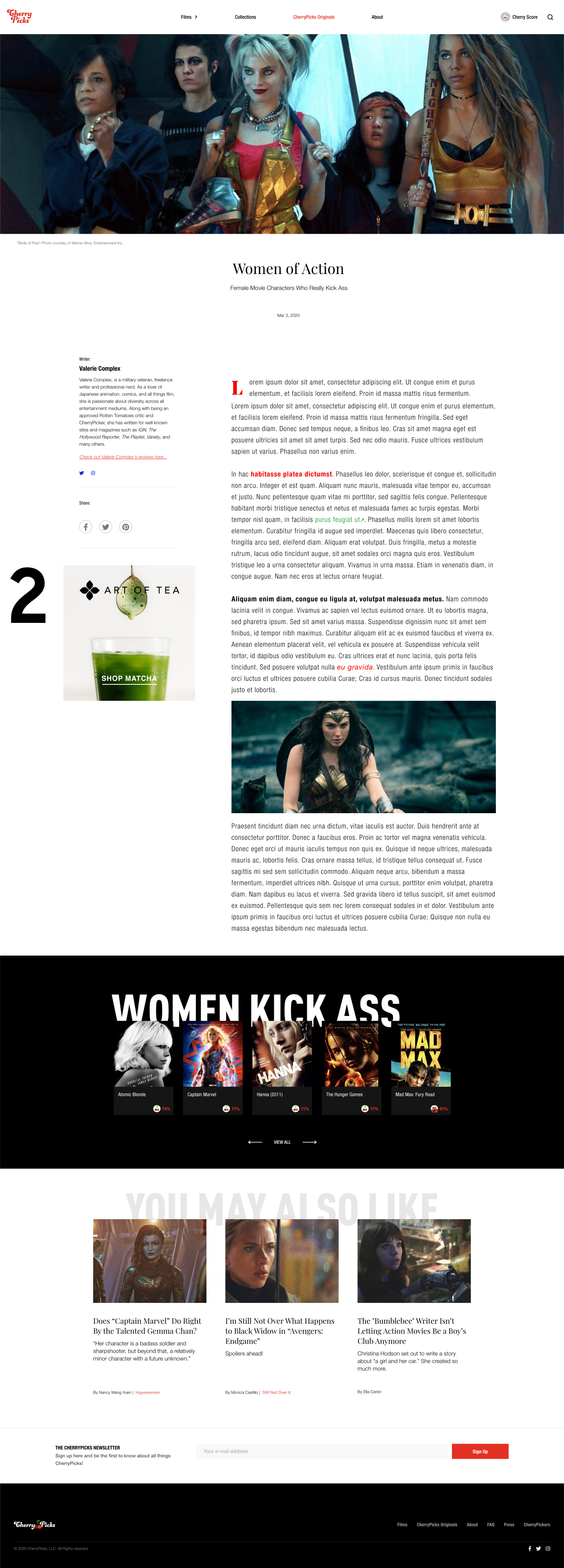
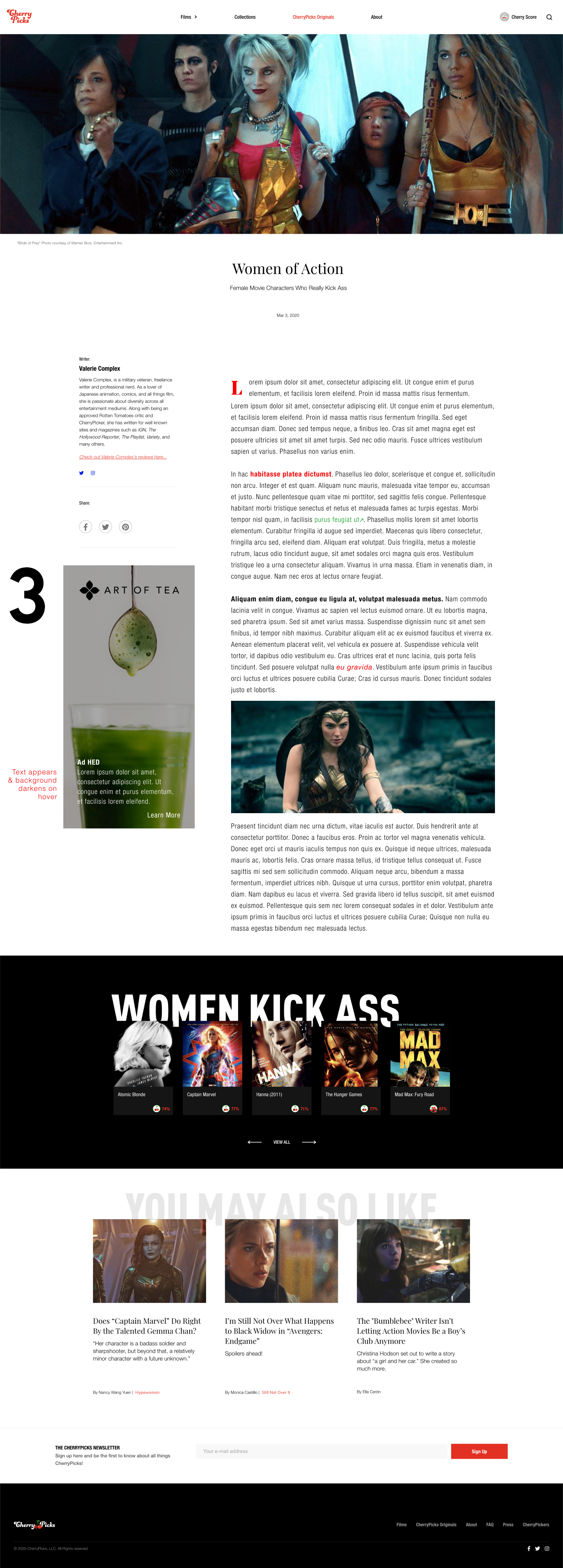
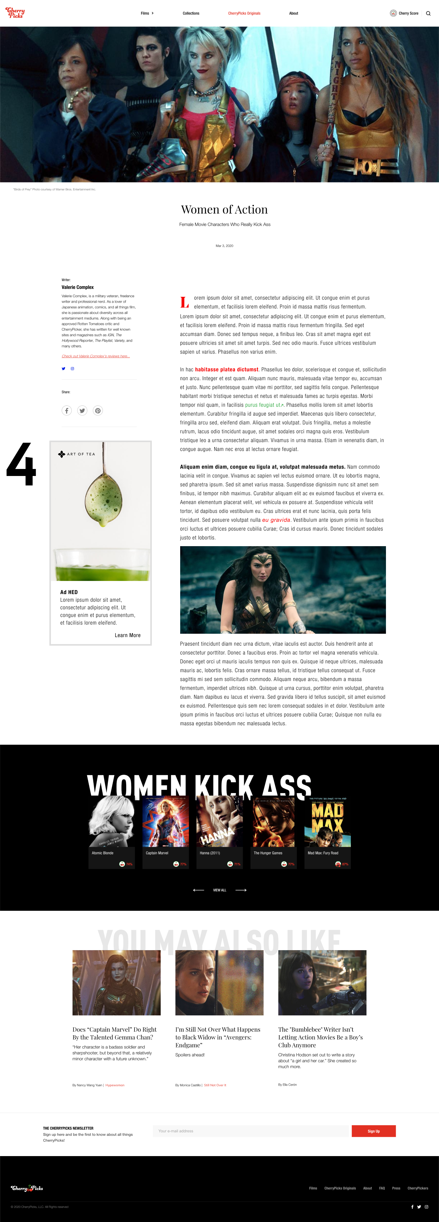


Final Implementation
As we did on the Film pages, we added an option for a mobile image upload. If none is provided, the 300x600 px desktop ad is cropped. Else, the 300x250 px mobile ad image is used. The ad opens in a new window.
Point of Friction - Mobile Ad insertion
Initially, I planned to uniformly insert the mobile ad after a set number of paragraphs in all Originals; however, the article body isn't a standard Rich Text field. Page editors build the body in the CMS by adding a series of widgets. So, the body could be comprised of multiple objects of the type PARAGRAPH, BODY_IMAGE, EMBEDDED_PAGE, PULL_QUOTE, ASIDE_IMAGE, and ASIDE_PARAGRAPH. Since I had a short time to implement this feature, I decided to forgo creating stipulations for each type in favor of inserting the ad after the first body section--whatever type it may be. In the end, this was preferable, since they now had control over where the ad appeared in the story.

